fNIRS motor-task activation for left- and right-hand finger-thumb tapping

Does fNIRS See What fMRI Sees? Our SfN 2026 Poster, Interactive

Next week I’ll be in Washington, D.C. for Neuroscience 2026, the Society for Neuroscience meeting, with a new poster from our lab: “fNIRS-fMRI Reliability for Motor and Social Perception Paradigms: Validation of fNIRS Against fMRI.” It asks a simple question that sits under almost everything we do: when fNIRS says part of the brain is active, does fMRI agree? Below is a plain-language summary and an interactive version of the poster you can click through.

The question

Our lab uses fNIRS (functional near-infrared spectroscopy), which measures hemodynamic, or blood-flow, responses with optodes placed on the scalp. Its big advantage is that it lets us study people in natural situations, including live, face-to-face interaction, which is exactly what developmental and social neuroscience needs. But fMRI is still the reference standard, and fNIRS needs to be checked against it systematically, on more than simple reference tasks. So we compared the two directly.

What we did

We used two calibrated benchmark tasks and ran each one with fNIRS (a Shimadzu LABNIRS system) and with fMRI (a Siemens MAGNETOM Prisma 3T).

  • Finger-thumb tapping. People tapped with the left hand or the right hand in 15-second blocks with 15 seconds of rest, for 6 minutes, with the same timing for fNIRS and fMRI. This is a focal test: it should light up primary sensorimotor cortex on the side opposite the hand.
  • Dynamic faces. People watched short videos of children’s faces smiling, moving and chewing (stimuli from Pitcher and colleagues, 2011). This targets the face network, especially the posterior superior temporal sulcus (pSTS), a region that is central to social perception.
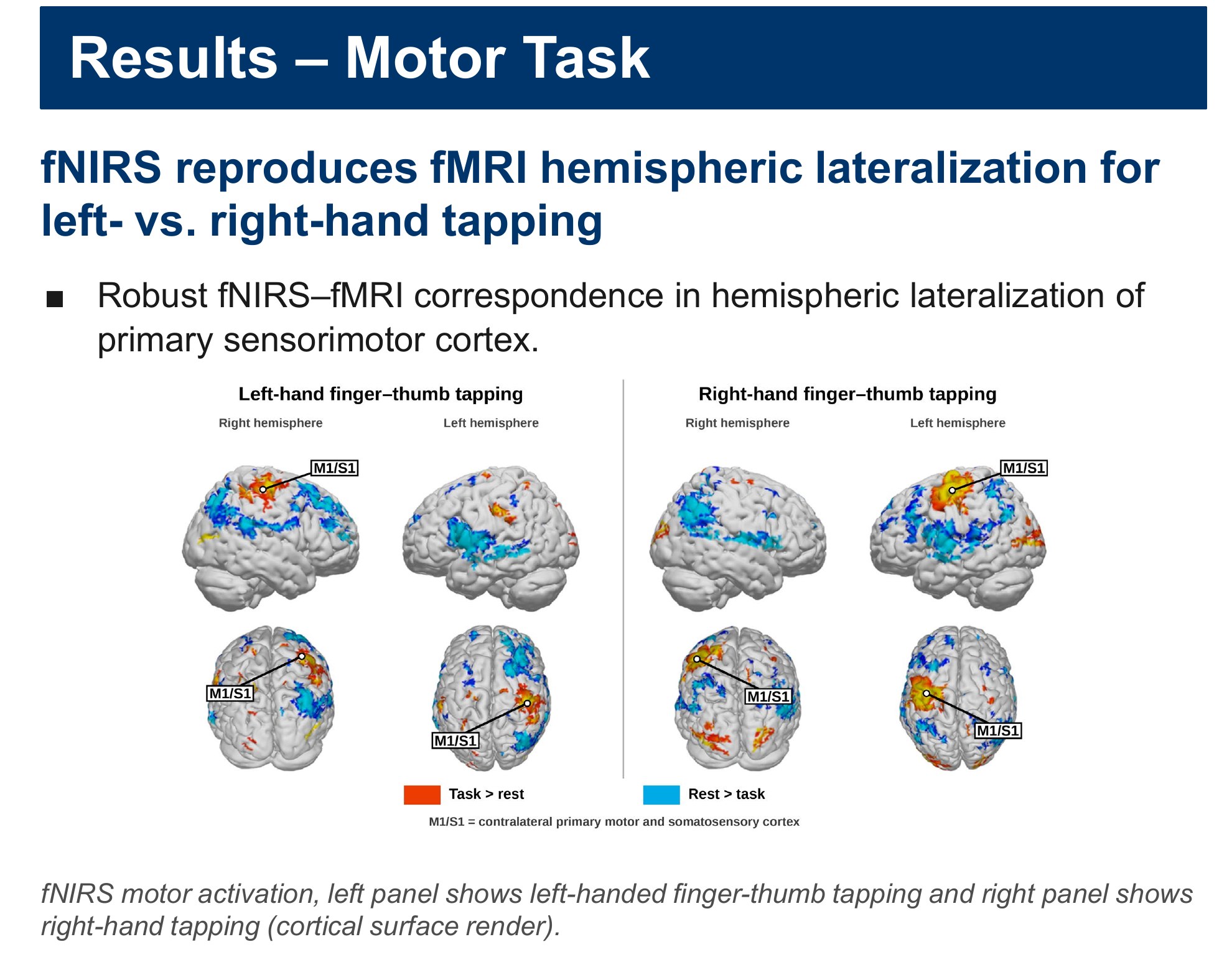
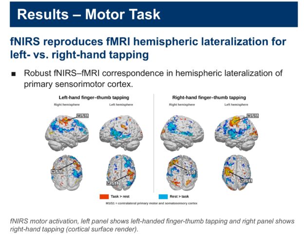
fNIRS motor-task activation on the cortical surface for left-hand and right-hand finger-thumb tapping, with primary sensorimotor cortex (M1/S1) labelled
From the poster: fNIRS reproduces the left/right pattern of the motor task. Left panel, left-hand tapping; right panel, right-hand tapping.

What we found

For the motor task, fNIRS reproduced the hemispheric lateralization seen with fMRI: left-hand tapping drove the right primary sensorimotor cortex and right-hand tapping drove the left, with robust correspondence between the two methods.

For the face videos, both fNIRS and fMRI picked up the dynamic-face network, including multiple sites along the pSTS. fNIRS reliably detected activity in visual and lateral-occipital cortex and in the superior and middle temporal lobes, with high spatial correspondence to the fMRI BOLD signal. Overall, the two methods showed strong spatial agreement in both tasks.

We are also working on the depth question. Continuous-wave fNIRS sees superficial cortex, roughly half the distance between a source and a detector, while fMRI is fully 3D. Using one participant’s own fMRI and anatomical scans together with a NeuroDOT sensitivity model, we are building a pipeline to estimate how well fNIRS reaches the superficial and deeper parts of the fusiform face area and the pSTS.

Why it matters

In the scanner, social stimuli have to be recorded video, and that removes two things that define a real social exchange: a recorded face can’t return your eye contact, and it can’t react to or mirror your expressions. fNIRS has neither limit, so we can study live, face-to-face interaction with real two-way gaze and facial expression. Showing that fNIRS agrees with fMRI on these benchmarks supports using it in developmental settings where fMRI is impractical and where ecological validity really matters. The honest caveat is depth: fNIRS measures cortex only to a limited depth, and any comparison with fMRI has to take that into account.

Explore the poster

Click any part of the poster to open a zoomed-in, high-resolution view of that panel with a short explanation, then use Next and Previous (or your arrow keys) to step through it in reading order. Guided tour walks you through the whole thing from the top, and you can zoom, pan or go fullscreen on the full poster. On a phone, use the list of sections under the poster. Press Esc to close a panel.
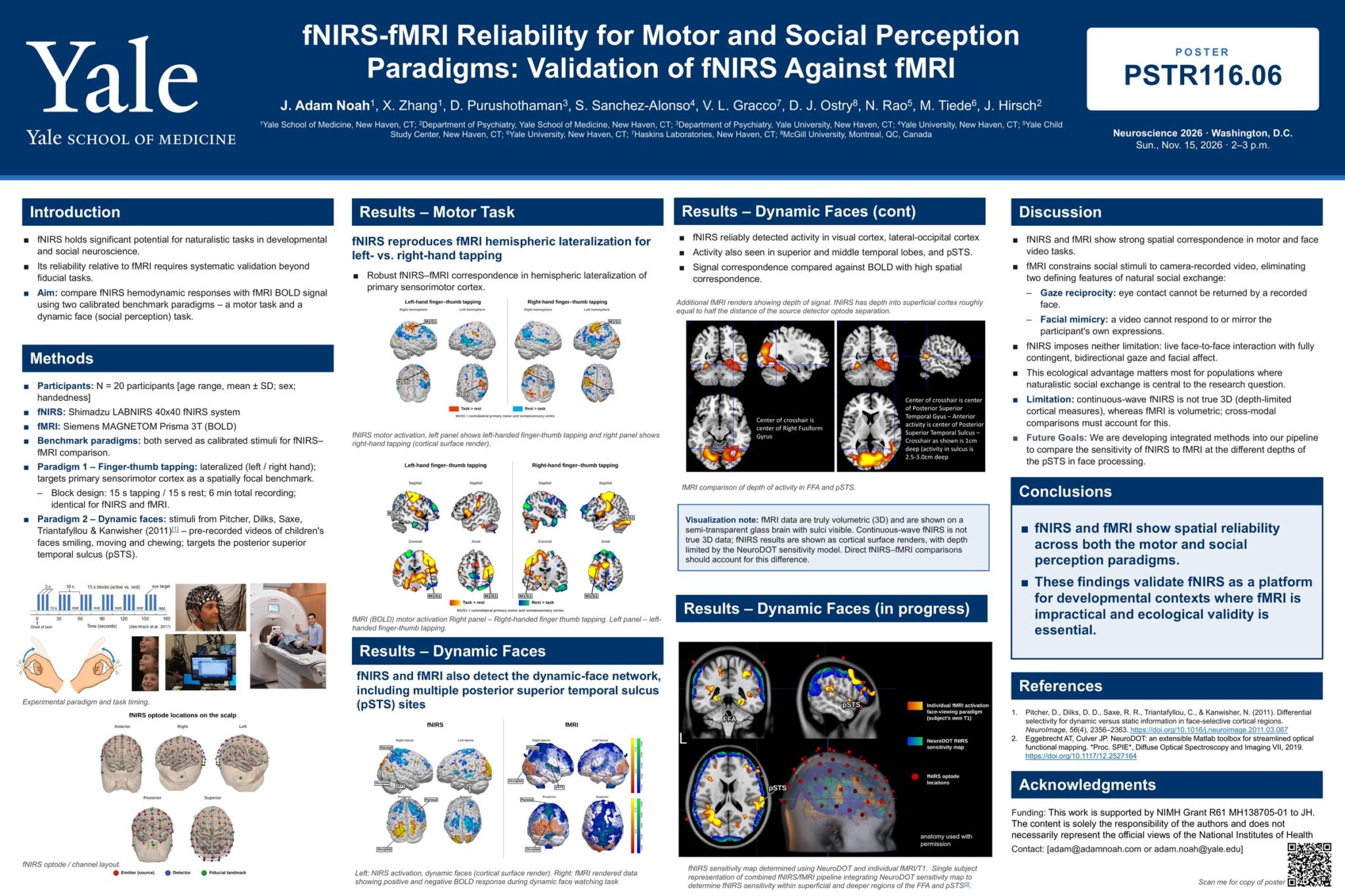
Click any part of the poster to open it. In a panel, click the image to see it full size.
The full SfN 2026 poster. Each section is a clickable region.

Our poster for Neuroscience 2026 in Washington, D.C.: fNIRS-fMRI Reliability for Motor and Social Perception Paradigms: Validation of fNIRS Against fMRI. It is poster PSTR116.06, listed for Sunday, Nov. 15, 2026, 2–3 p.m.

Authors: J. Adam Noah, X. Zhang, D. Purushothaman, S. Sanchez-Alonso, V. L. Gracco, D. J. Ostry, N. Rao, M. Tiede and J. Hirsch, from the Yale School of Medicine, Yale University, the Yale Child Study Center, Haskins Laboratories and McGill University.

fNIRS (functional near-infrared spectroscopy) has a lot of promise for natural, real-world tasks in developmental and social neuroscience. But before we lean on it, we need to know how well it agrees with fMRI, and that has to be tested on more than simple reference tasks.

The aim: compare fNIRS hemodynamic (blood-flow) responses with the fMRI BOLD signal using two calibrated benchmark tasks, one motor task and one dynamic-face (social perception) task.

The same benchmark tasks were run with fNIRS (a Shimadzu LABNIRS system) and with fMRI (a Siemens MAGNETOM Prisma 3T scanner).

  • Task 1, finger-thumb tapping: left hand or right hand, a focal benchmark for primary sensorimotor cortex. Blocks of 15 s tapping and 15 s rest, 6 minutes in total, identical for fNIRS and fMRI.
  • Task 2, dynamic faces: pre-recorded videos of children’s faces smiling, moving and chewing (stimuli from Pitcher et al., 2011), aimed at the posterior superior temporal sulcus (pSTS).

The figure shows the task timing and the recording setups.

Where the fNIRS sensors sit. The scalp models show the optode layout from the front, right, left, back and top. Red dots are emitters (light sources), blue dots are detectors, and green dots are fiducial landmarks used to line the cap up on the head.

fNIRS reproduces the left/right pattern seen in fMRI. When people tapped with the left hand, activity showed up in the right primary sensorimotor cortex (labelled M1/S1), and the reverse for the right hand.

These are fNIRS results drawn on the cortical surface: left panel for left-hand tapping, right panel for right-hand tapping. Warm colors are task > rest; blue is rest > task.

The same tapping task measured with fMRI (BOLD), shown in sagittal, coronal and axial slices. The M1/S1 labels mark primary sensorimotor cortex on the side opposite the tapping hand, which is the pattern fNIRS picked up in the previous panel. Together they show robust fNIRS–fMRI agreement in hemispheric lateralization.

Both methods pick up the face network. While people watched the dynamic face videos, fNIRS (left) and fMRI (right) both detected the dynamic-face network, including multiple sites along the posterior superior temporal sulcus (pSTS). The fMRI renders show both positive and negative BOLD responses.

fNIRS reliably detected activity in visual cortex and lateral-occipital cortex, and also in the superior and middle temporal lobes and pSTS, with high spatial correspondence to the fMRI BOLD signal.

The fMRI slices show how deep that activity sits. One crosshair marks the right fusiform gyrus; the other marks the pSTS, where the crosshair is about 1 cm deep and activity in the sulcus is 2.5–3.0 cm deep. fNIRS reaches into superficial cortex, roughly half the distance between a source and a detector optode.

A note on the pictures. fMRI data are truly 3D, so they are shown in a semi-transparent glass brain with the sulci visible. Continuous-wave fNIRS is not true 3D data, so its results are drawn on the cortical surface, with depth limited by the NeuroDOT sensitivity model. Any direct fNIRS–fMRI comparison has to account for that difference.

Work in progress: how deep can fNIRS see? For a single participant, we combined that person’s own fMRI and T1 anatomical scans with a NeuroDOT fNIRS sensitivity map. Overlaying the fMRI face activation, the fNIRS sensitivity and the optode positions lets us estimate how sensitive fNIRS is to the superficial and deeper parts of two face areas, the fusiform face area (FFA) and the pSTS.

fNIRS and fMRI line up well in space for both the motor task and the face-video task.

Why that matters: in the scanner, social stimuli have to be recorded video, which removes two defining parts of real social exchange. A recorded face can’t return your eye contact (gaze reciprocity), and it can’t respond to or mirror your expressions (facial mimicry). fNIRS has neither limit, so we can study live, face-to-face interaction with real two-way gaze and facial expression. That matters most for groups where natural social exchange is central to the question.

The limitation: continuous-wave fNIRS only measures cortex to a limited depth, while fMRI is volumetric. Next, we are building methods into our pipeline to compare fNIRS and fMRI sensitivity at different depths of the pSTS during face processing.

The take-home: fNIRS and fMRI show spatial reliability across both the motor and the social perception tasks. That supports fNIRS as a platform for developmental settings where fMRI is impractical and ecological validity is essential.

The face videos come from Pitcher, Dilks, Saxe, Triantafyllou & Kanwisher (2011, NeuroImage), and the sensitivity modelling uses the NeuroDOT toolbox (Eggebrecht & Culver, 2019).

This work is supported by NIMH Grant R61 MH138705-01 to J. Hirsch. The content is solely the responsibility of the authors and does not necessarily represent the official views of the National Institutes of Health.
Download the full poster (PDF)

Come by if you’re at SfN

If you’re at Neuroscience 2026 in Washington, D.C., come find me at poster PSTR116.06 on Sunday, November 15. I’ll be at the poster from 1 p.m. (the time printed on the poster is 2–3 p.m.). Stop by and talk with me about what the lab is doing; I’d love to hear what you’re working on too.

Poster details

Title: fNIRS-fMRI Reliability for Motor and Social Perception Paradigms: Validation of fNIRS Against fMRI
Authors: J. Adam Noah, X. Zhang, D. Purushothaman, S. Sanchez-Alonso, V. L. Gracco, D. J. Ostry, N. Rao, M. Tiede, J. Hirsch
Affiliations: Yale School of Medicine; Department of Psychiatry, Yale School of Medicine; Department of Psychiatry, Yale University; Yale University; Yale Child Study Center; Haskins Laboratories; McGill University
Poster: PSTR116.06, Neuroscience 2026, Washington, D.C., Sun., Nov. 15, 2026, 2–3 p.m.

This work is supported by NIMH Grant R61 MH138705-01 to J. Hirsch. The content is solely the responsibility of the authors and does not necessarily represent the official views of the National Institutes of Health.
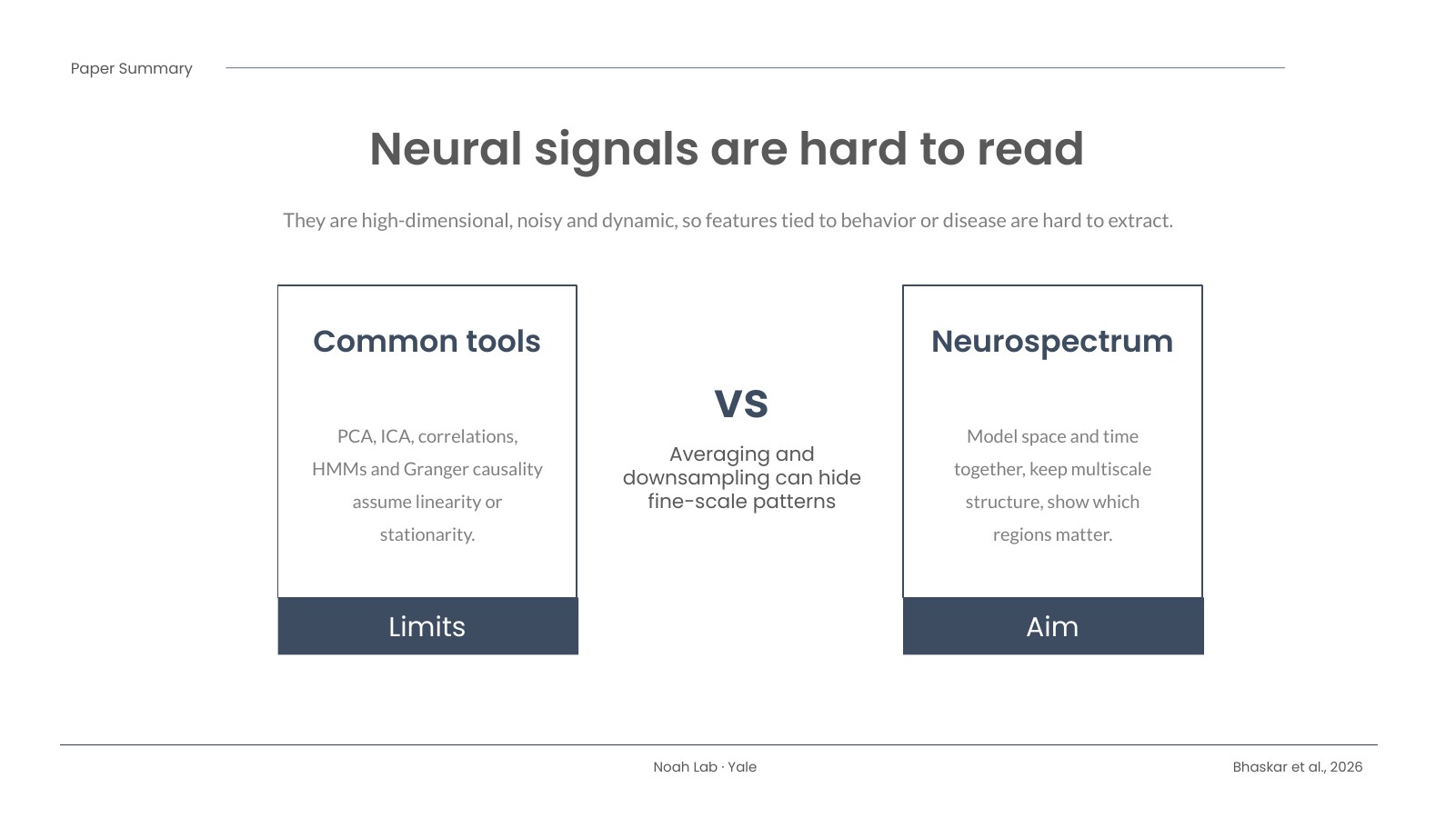
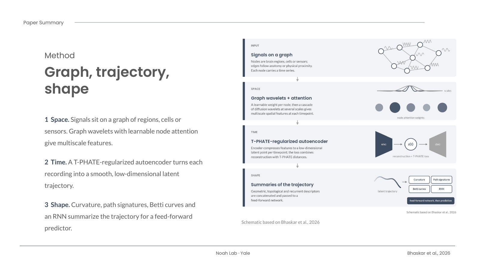
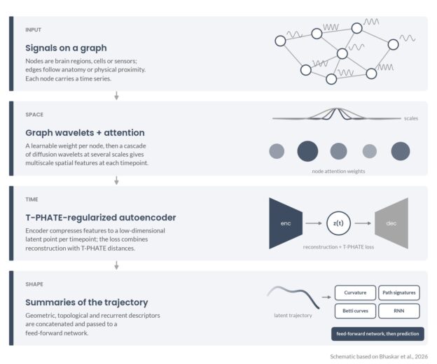
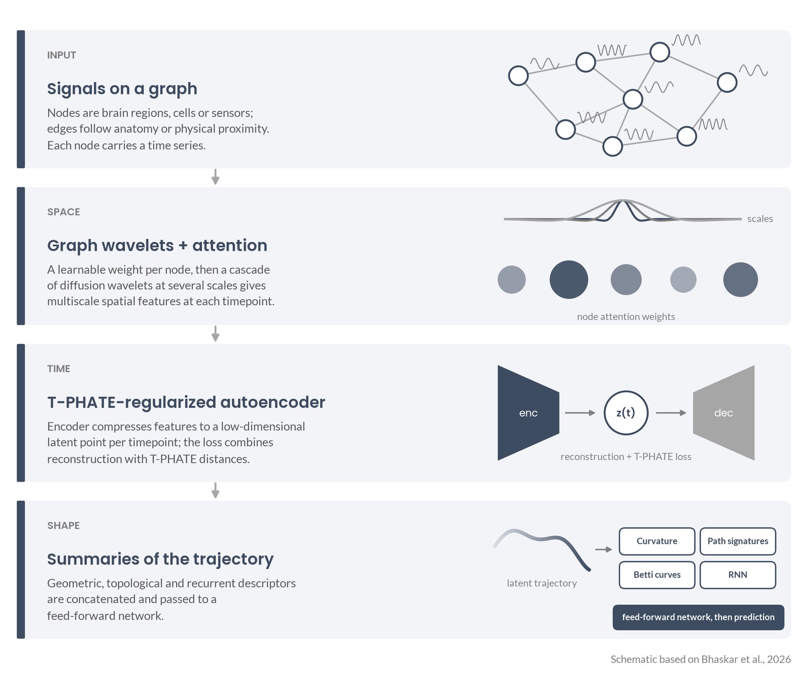
Schematic of the Neurospectrum pipeline in four stacked steps: signals on a graph; graph wavelets with node attention; a T-PHATE-regularized autoencoder producing a latent trajectory; curvature, path signatures, Betti curves and RNN summaries feeding a feed-forward network

Reading the Shape of Brain Activity: Our Neurospectrum Paper

I’m happy to share a new paper I co-authored, now out in Neurocomputing: “Neurospectrum: A geometric and topological deep learning framework for uncovering spatiotemporal signatures in neural activity.” First author Dhananjay Bhaskar and senior author Smita Krishnaswamy led a big team on this one, and I’m glad I got to be part of it. Below is a short plain-language summary, followed by a slide deck you can click through or download.

Schematic of the Neurospectrum pipeline in four stacked steps: signals on a graph; graph wavelets with node attention; a T-PHATE-regularized autoencoder producing a latent trajectory; curvature, path signatures, Betti curves and RNN summaries feeding a feed-forward network
Schematic based on Bhaskar et al., 2026: how Neurospectrum goes from signals on a graph to a trajectory and its shape. My own drawing, based on the paper’s description.

The problem

Brain recordings are messy. Whether it’s fMRI, calcium imaging, or the optical signals my lab works with, the data are high-dimensional, noisy, and always changing. Many of the standard tools, like PCA, ICA, and correlation-based connectivity, lean on assumptions such as linearity or stationarity, and they often average over space or time. That can wash out the fine-scale, moment-to-moment patterns we actually care about.

What we did

Neurospectrum treats brain activity as a path through time and then asks what shape that path has. It works in three steps:

  • Space. At each moment, the signals sit on a graph of brain regions, cells, or sensors. Graph wavelets pick up patterns at several spatial scales, and a learnable attention step weights the regions that matter most.
  • Time. An autoencoder, regularized with a manifold-learning method called T-PHATE, compresses each recording into a smooth, low-dimensional trajectory.
  • Shape. The trajectory is summarized by its curvature (how sharply it turns), path signatures, Betti curves from persistent homology (its topology), and a recurrent network. Those features feed a small predictor.

The pieces are modular, so you can swap summaries in or out, and when they are differentiable the whole thing can be trained end to end.

What we found

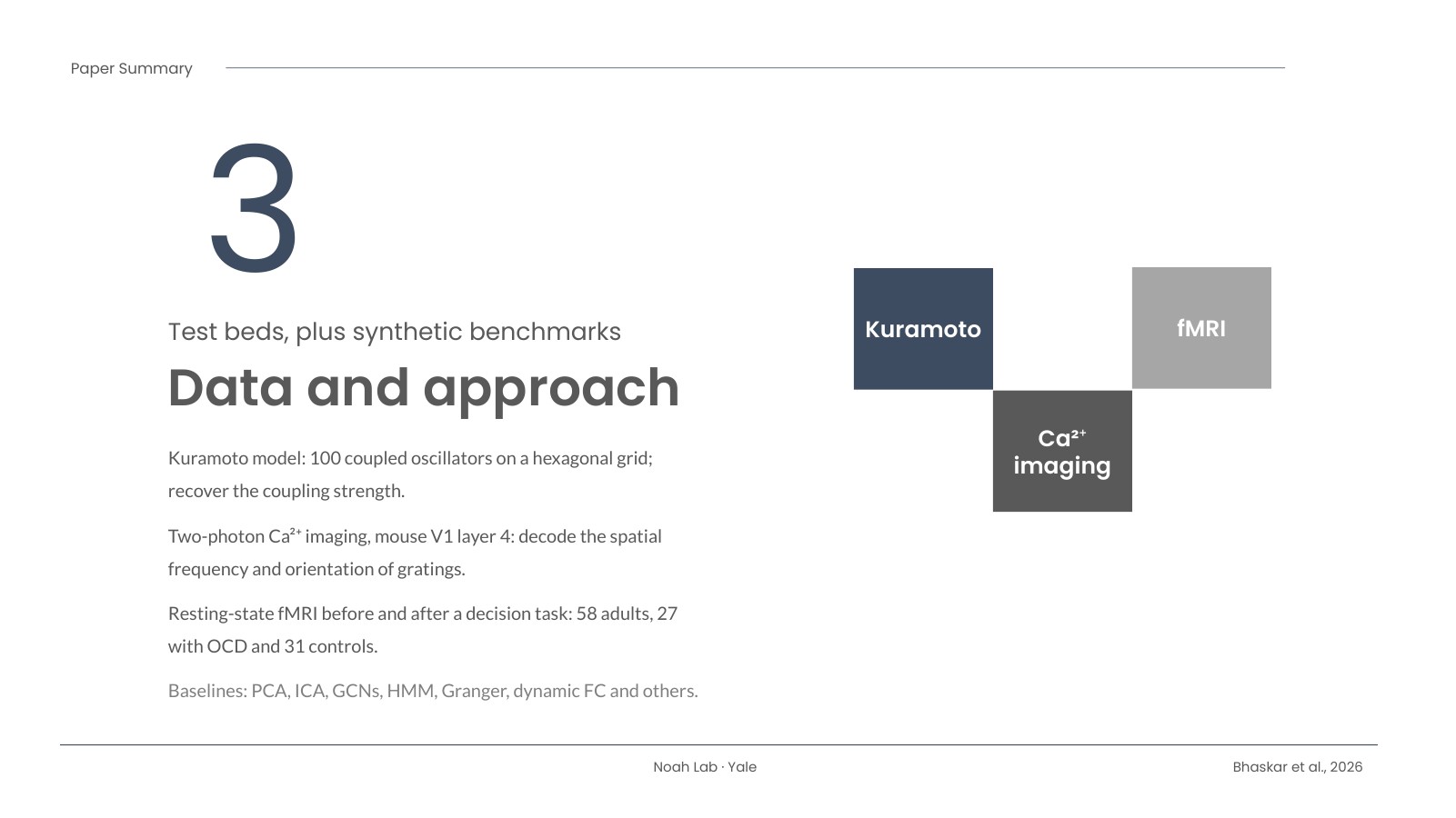
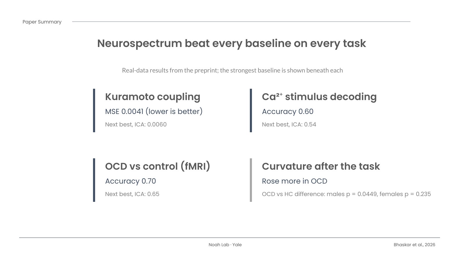
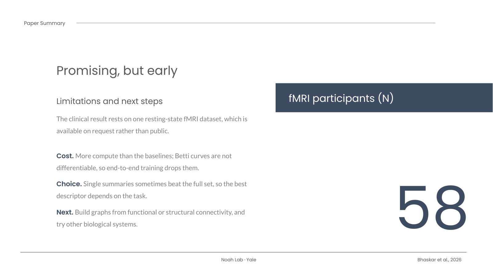
The team tested it on simulated coupled oscillators (the Kuramoto model, 100 oscillators), two-photon calcium imaging from mouse visual cortex, and resting-state fMRI collected before and after a decision-making task in 58 adults (27 with OCD, 31 healthy controls). Neurospectrum beat every baseline on every task. Recovering the oscillators’ coupling strength, its error was 0.0041 versus 0.0060 for the next-best method (ICA). Decoding the visual stimulus, accuracy was 0.60 versus 0.54. Telling OCD from control participants, accuracy was 0.70 versus 0.65.

The part I find most interesting: after the task, people’s brain trajectories bent more sharply, and that rise in curvature was larger in OCD. The group difference was statistically significant in males (p = 0.0449) but not in females (p = 0.235). The attention maps also pointed to different regions by sex, such as the posterior putamen in female participants and the superior frontal sulcus in male participants.

Why it matters

This isn’t just a better classifier. It produces features you can look at and reason about, like how much a brain state “turns” after a task, or which regions drive a difference. The paper didn’t use fNIRS, but the graph nodes can be sensor locations, and the wavelet step is designed to be robust to differences in sensor indexing and placement. That makes fNIRS optode montages a natural next test, and I’d like to try it. There are caveats: the clinical result rests on a single fMRI dataset, the method costs more compute than simpler tools, and the best summary feature depends on the task. The numbers above are from the open preprint, and the code is on GitHub.

Read the paper

Article (DOI): https://doi.org/10.1016/j.neucom.2026.135412
Open preprint (bioRxiv): https://doi.org/10.1101/2023.03.22.533807

Citation: Bhaskar D, Zhang Y, Moore J, Ketonis P, Gao F, Grossenbacher-Rieck B, Wolf G, Khasawneh FA, Munch E, Noah JA, Pushkarskaya H, Pittenger C, Greco V, Krishnaswamy S. Neurospectrum: A geometric and topological deep learning framework for uncovering spatiotemporal signatures in neural activity. Neurocomputing. 2026;710:135412. doi:10.1016/j.neucom.2026.135412

The slides

Here is my eight-slide summary of the paper. Use the arrows, your keyboard’s arrow keys, or the thumbnails, and hit Fullscreen for a bigger view.

Title slide: Neurospectrum, a geometric and topological deep learning framework for uncovering spatiotemporal signatures in neural activity, with the full citationBackground slide: neural signals are hard to read; common tools versus NeurospectrumData and approach slide: Kuramoto simulations, calcium imaging and fMRI test bedsMethod slide: graph, trajectory, shape, with a schematic of the Neurospectrum pipelineResults slide: Neurospectrum beat every baseline on every task, with four key numbersSlide: what this could mean for fNIRS, ideas to tryLimitations and next steps slide, with 58 fMRI participantsReference and links slide with the DOI, preprint and code links
1 / 8

Download the slides (PowerPoint)

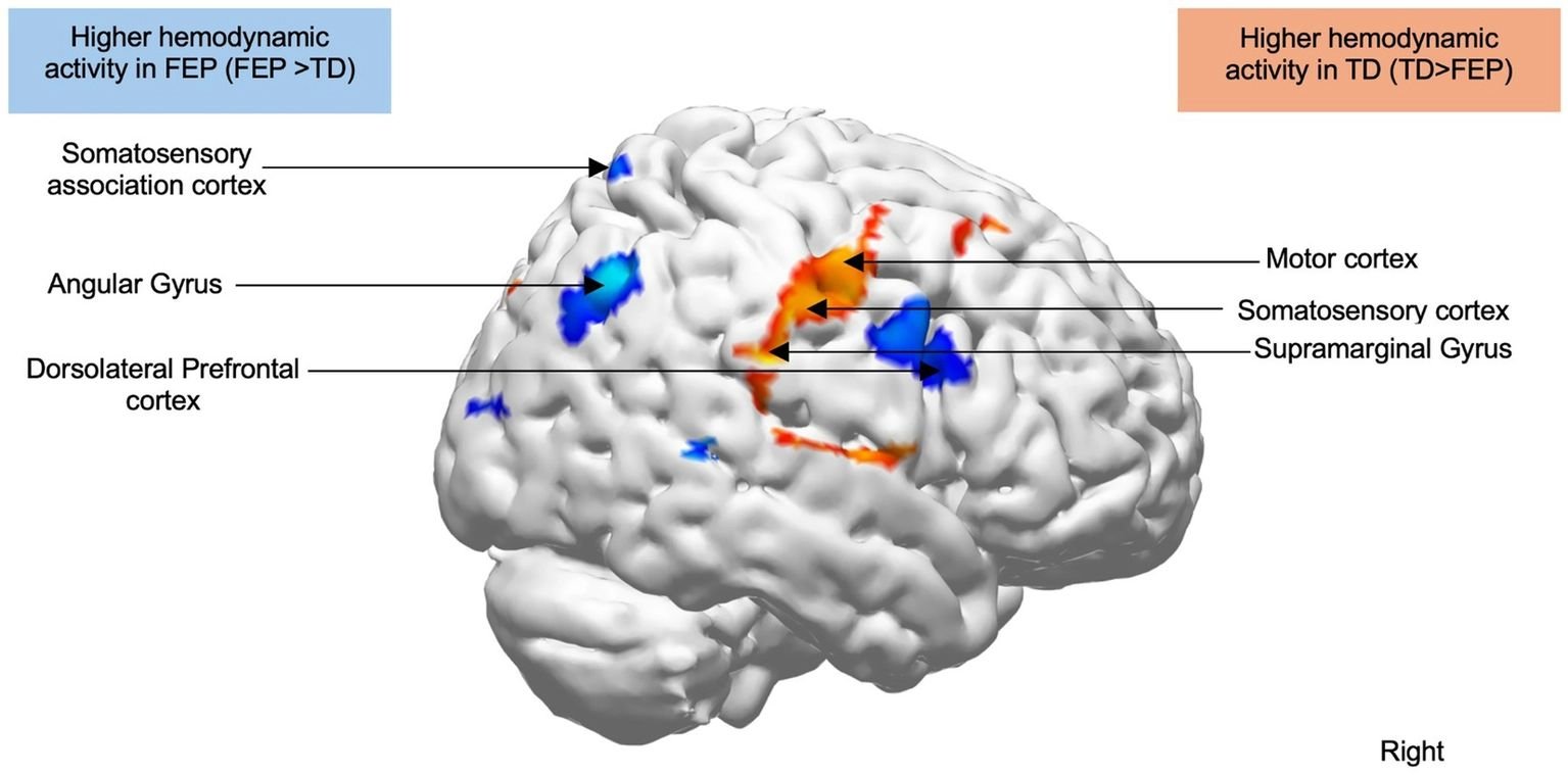
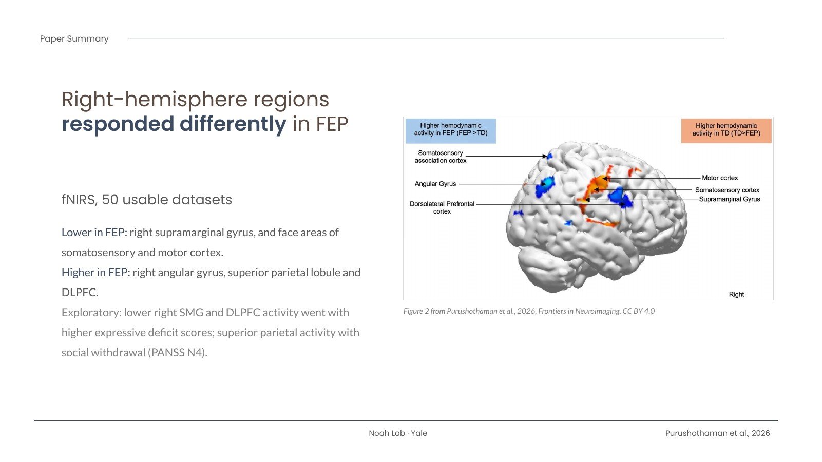
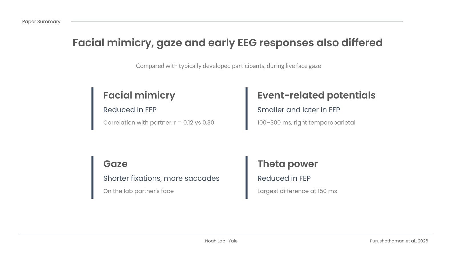
Right-hemisphere brain rendering from Figure 2 of Purushothaman et al. 2026: red-yellow clusters (supramarginal gyrus, somatosensory and motor cortex face areas) show lower activity in first episode psychosis than in typically developed participants; blue clusters (angular gyrus, somatosensory association cortex, dorsolateral prefrontal cortex) show higher activity.

Looking at a Live Face: What We Learned About Early Psychosis

Our new paper is out in Frontiers in Neuroimaging, led by Deepa Purushothaman with Xian Zhang, Rahul Singh, Cenk Tek, Vinod Srihari, Joy Hirsch and me. It asks a simple question with a complicated answer: what is different in the brain when someone early in the course of psychosis looks at another person’s face, live, in the same room? The article is open access: read it here (doi:10.3389/fnimg.2026.1931240).

The problem

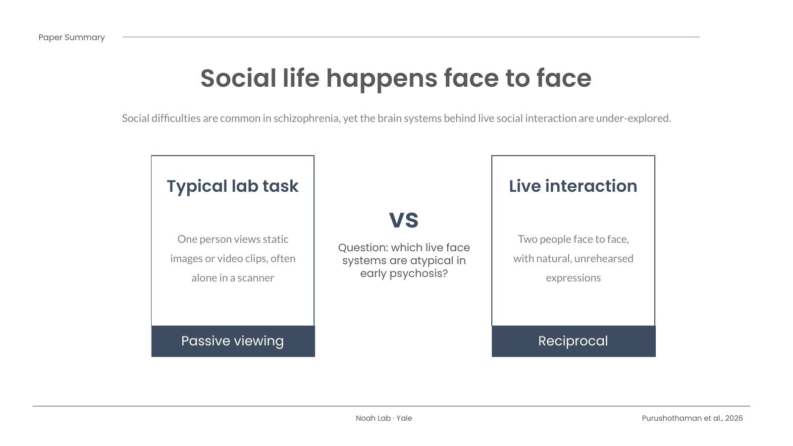
Difficulties with social interaction are common in schizophrenia, and they matter a great deal for how people do in daily life. Yet most of what we know about the social brain in schizophrenia comes from people looking at photos or video clips, usually alone, lying in a scanner. Real conversations aren’t like that. They are face to face, reciprocal and unscripted, and our earlier work suggests the brain handles a live face differently from a face on a screen.

What we did

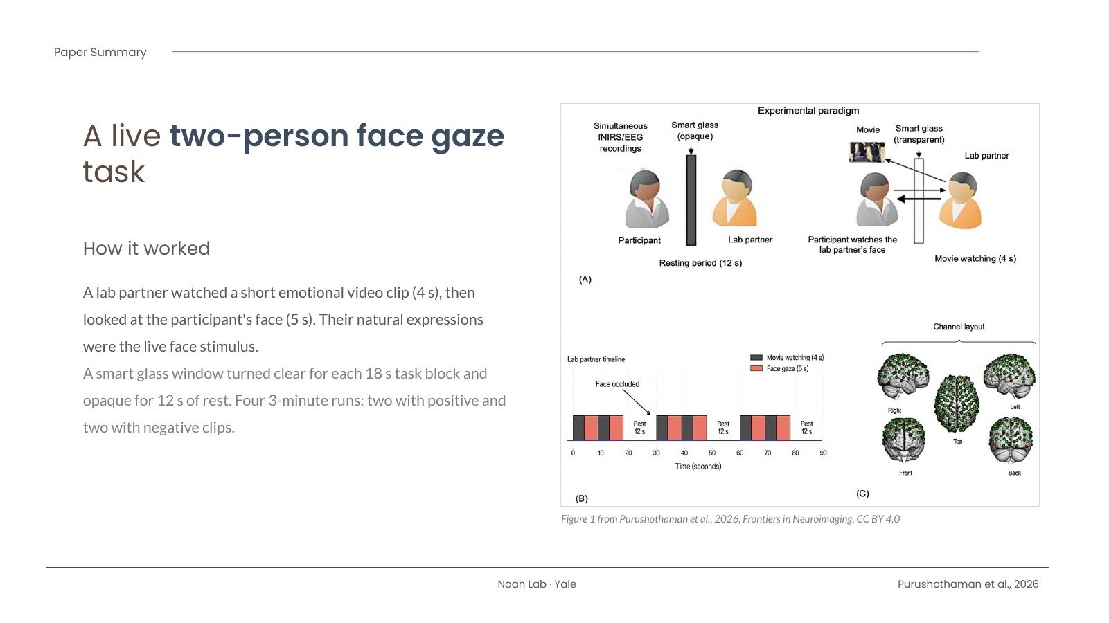
We used a two-person face gaze task that our lab has used before. A lab partner sat across a table from each participant, separated by a “smart glass” window that could switch from opaque to clear. The partner watched short, emotionally evocative video clips (cute animals, or things like spiders and decay) and then looked at the participant, so the participant saw a real person’s natural, unrehearsed expressions.

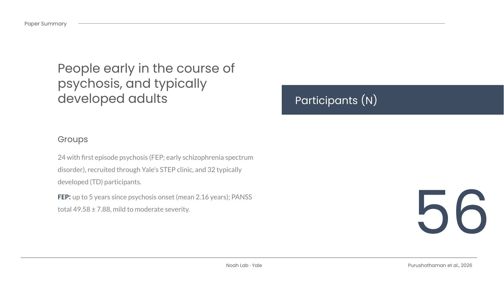
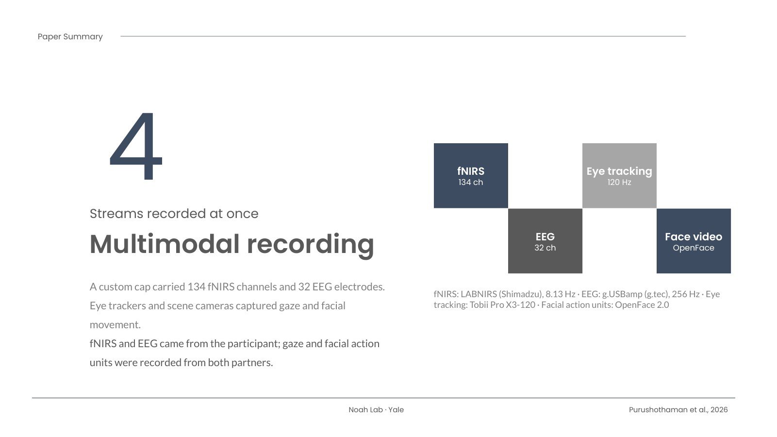
While this happened we recorded several things at once: fNIRS (134 channels) and EEG (32 electrodes) from a single cap, eye tracking, and video of facial movements analyzed with OpenFace. We compared 24 people with first episode psychosis (early schizophrenia spectrum disorders), recruited through Yale’s STEP clinic, with 32 typically developed participants.

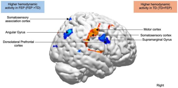
Right-hemisphere brain rendering from Figure 2: red-yellow clusters (supramarginal gyrus, somatosensory and motor cortex face areas) show lower activity in first episode psychosis than in typically developed participants; blue clusters (angular gyrus, somatosensory association cortex, dorsolateral prefrontal cortex) show higher activity.
Brain regions where activity during live face gaze differed between groups. Red-yellow: lower in first episode psychosis; blue: higher. Figure from Purushothaman et al., 2026, Frontiers in Neuroimaging, CC BY 4.0.

What we found

Activity in a set of right-hemisphere regions differed between the groups. The right supramarginal gyrus, a region we have repeatedly linked to live face gaze, along with the face areas of the right somatosensory and motor cortex, was less active in the first episode psychosis group. The right angular gyrus, superior parietal lobule and dorsolateral prefrontal cortex were more active.

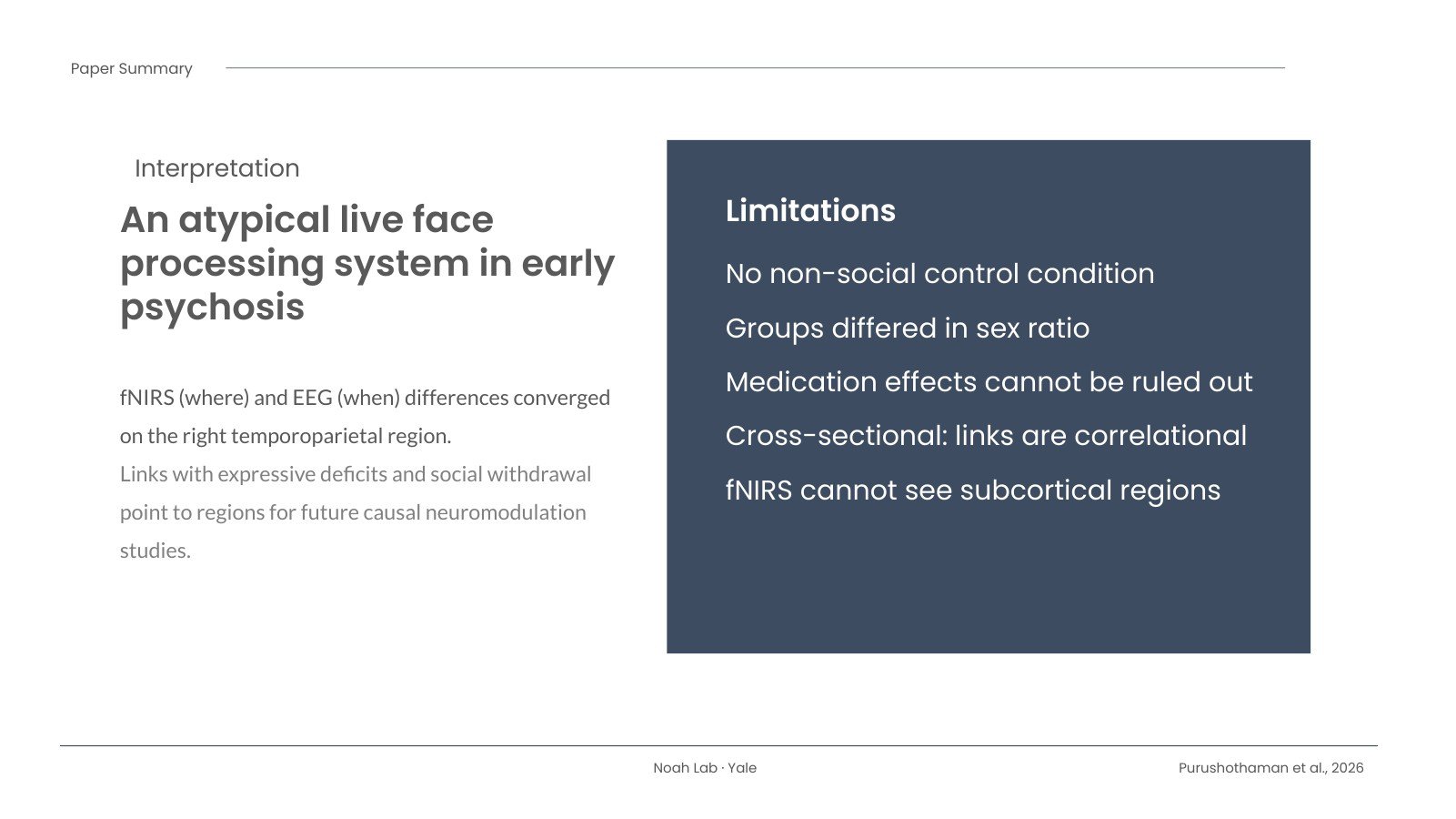
In exploratory analyses, lower activity in the right supramarginal gyrus and DLPFC went with higher expressive deficit scores (blunted affect, poor rapport, less spontaneous conversation and slowed movement), and activity in the superior parietal region went with passive social withdrawal.

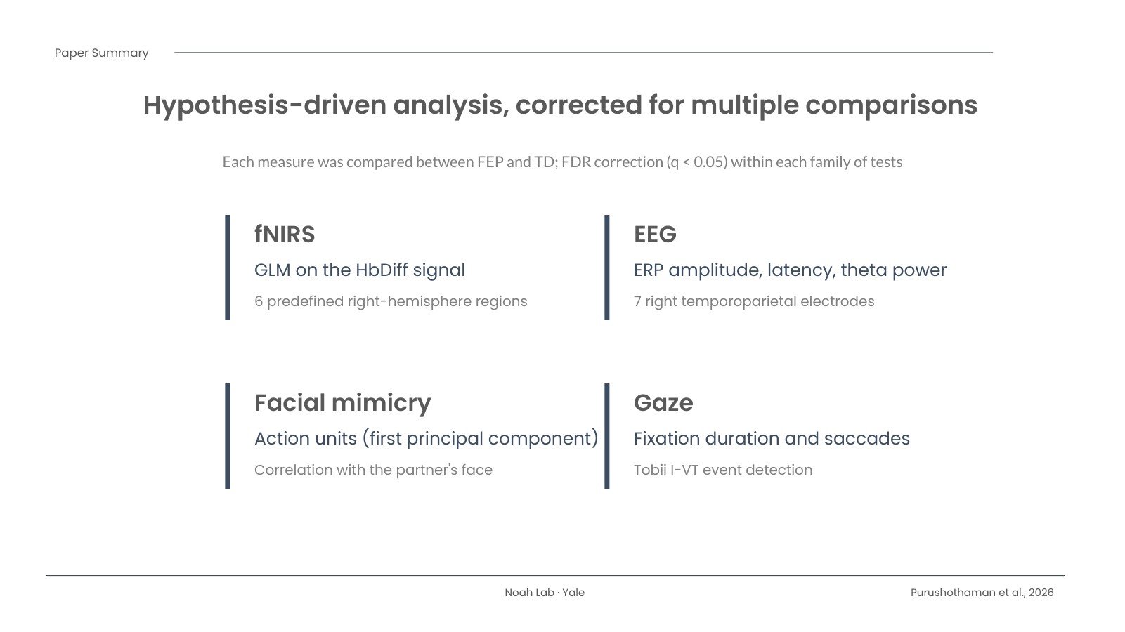
Behavior and EEG told a consistent story. Participants with first episode psychosis showed less spontaneous facial mimicry of their partner, shorter fixations on the partner’s face and more frequent saccades. In the first 100 to 300 milliseconds after the window cleared, their EEG responses were smaller over right temporoparietal electrodes and delayed over temporoparietal electrodes on both sides, and theta power was reduced. So the “where” from fNIRS and the “when” from EEG pointed to the same right temporoparietal area.

Why it matters, and what it doesn’t show

This is a step toward measuring social brain function in a setting that looks more like everyday life, at a stage of illness when people may benefit most from new kinds of support. The regions we found could become targets for future studies that test cause and effect, for example with non-invasive neuromodulation.

It is also important to be clear about the limits. The study is cross-sectional, so these links are correlational. There was no non-social control condition, the groups differed in sex ratio, most participants with psychosis were taking medication, and fNIRS can’t see deeper brain structures. We hope this work helps build better tools, not labels. I’m grateful to everyone who took part.

The slides

Here is a short slide summary of the paper. Use the arrows, your keyboard, or the thumbnails to move through it.

Slide 1: Title and citationSlide 2: Background and questionSlide 3: ParticipantsSlide 4: The live face gaze taskSlide 5: Multimodal recordingSlide 6: AnalysisSlide 7: fNIRS resultsSlide 8: Behavior and EEG resultsSlide 9: Interpretation and limitationsSlide 10: Reference and links
1 / 10

Download the slides (PowerPoint)

Read the paper

Purushothaman D, Noah JA, Zhang X, Singh R, Tek C, Srihari VH, Hirsch J. A multimodal approach to identify atypical face processing in first episode psychosis (early schizophrenia spectrum disorders). Frontiers in Neuroimaging. 2026;5:1931240. doi: 10.3389/fnimg.2026.1931240

The article is open access under a CC BY 4.0 license. The data are available through Dryad: doi:10.5061/dryad.gxd2547xn.

MLS NEXT U13 New England Standings – Nov 9, 2026

MLS NEXT Academy Division, U13 New England conference, standings as of Monday, November 9, 2026. A win is 3 points and a draw is 1 point. Teams are ranked by points per game (PPG), since they have played different numbers of games.

Weekend results now fully posted for Nov 7–8 include Vale Rush United 1–0 New York Elite Alleycats FC (home), FC Greater Boston Bolts 7–1 Valeo Futbol Club, and NEFC South 0–8 IFA West. Vale Rush United is 3-0-3 with 9 points, 9th in the conference on PPG.

# Team GP W L D GF GA GD Pts PPG
1 FC Greater Boston Bolts 8 7 0 1 31 5 +26 22 2.75
2 NEFC 8 7 0 1 31 9 +22 22 2.75
3 Ginga FC 6 4 1 1 22 15 +7 13 2.17
4 New England Surf SC 7 4 1 2 24 9 +15 14 2.00
5 New England Force 7 4 1 2 24 14 +10 14 2.00
6 IFA West 6 4 2 0 29 10 +19 12 2.00
7 New York Elite Alleycats FC 7 4 2 1 19 5 +14 13 1.86
8 Syracuse Development Academy 8 4 4 0 15 12 +3 12 1.50
9 Vale Rush United 6 3 3 0 20 12 +8 9 1.50
10 Bayside FC 8 3 3 2 18 18 0 11 1.38
11 New York Rush 8 3 4 1 18 27 -9 10 1.25
12 Seacoast United Mass 7 2 3 2 20 20 0 8 1.14
13 Intercontinental Football Academy of New England 8 2 3 3 16 13 +3 9 1.12
14 FC Greater Boston Bolts Metro North 8 3 5 0 16 26 -10 9 1.12
15 Seacoast United Bedford 8 2 4 2 8 12 -4 8 1.00
16 FC North 7 2 5 0 12 20 -8 6 0.86
17 NEFC South 7 1 6 0 10 47 -37 3 0.43
18 Rhode Island Surf SC 8 0 6 2 9 31 -22 2 0.25
19 Valeo Futbol Club 6 0 6 0 6 43 -37 0 0.00

Source: league match scores, league games only. Games without a posted score are not counted. Nov 8 scores that were still pending when this draft was first written are now included.

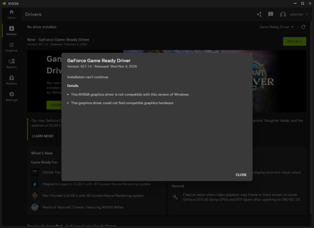
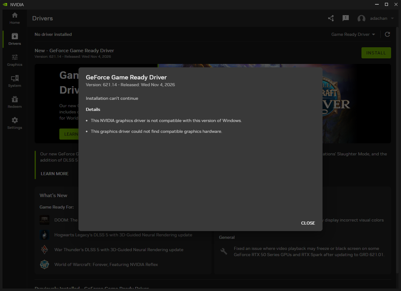
Screenshot of the NVIDIA app offering GeForce Game Ready Driver 621.14 with 'No driver installed' behind an 'Installation can't continue' dialog that says the driver is not compatible with this version of Windows and could not find compatible graphics hardware.

NVIDIA, You Had One Job: Install the Driver

Originally published on snarky.tech.

Installing a graphics driver should be the most boring thing a computer does. The app sees the video card, sees the version of Windows, downloads the matching driver, installs it, and tells you it worked. That’s it. That’s the whole job.

The NVIDIA app has turned this into a recurring adventure. For me, it fails regularly, and when it isn’t failing, it’s often showing me a status screen that doesn’t match what’s actually going on. This week’s episode is my favorite so far.

Screenshot of the NVIDIA app Drivers page showing 'No driver installed' and an offer to install GeForce Game Ready Driver 621.14, released Wed Nov 4, 2026, covered by a dialog reading 'Installation can't continue' with two details: 'This NVIDIA graphics driver is not compatible with this version of Windows' and 'This graphics driver could not find compatible graphics hardware.'
The NVIDIA app recommends a driver, offers an Install button, and then explains why that driver won’t install. My screenshot, unedited.

The app picked this driver. Then rejected it.

Look at the screen. Up top, the NVIDIA app announces “New – GeForce Game Ready Driver,” version 621.14, released Wednesday, November 4, 2026. There’s a big green INSTALL button. Behind it, a cheerful banner about new games and DLSS 5. This is the app’s own recommendation. Nobody went to a sketchy website. I clicked the button NVIDIA put in front of me.

And then: “Installation can’t continue.” Details: “This NVIDIA graphics driver is not compatible with this version of Windows.” And, as a bonus: “This graphics driver could not find compatible graphics hardware.”

So which is it? Wrong Windows? No hardware? Both? If the app can’t find NVIDIA hardware, why is the NVIDIA app offering me an NVIDIA driver for it? If my Windows isn’t supported, why did the app recommend this driver for my Windows? The app had all the information before it lit up that button. It just didn’t check until after I believed it.

“No driver installed.” Sure.

Then there’s the line in the top left: “No driver installed.” Maybe that’s true at that moment. Maybe it’s another one of those status screens I’ve learned not to trust. I genuinely can’t tell from the app, and that’s the problem. A driver tool has one dashboard that matters, the one that says what’s installed and whether the last install worked. If I can’t trust that screen, I can’t trust anything else the app tells me.

I’m not claiming to know what’s wrong under the hood. I’m saying the app doesn’t seem to know either, and it’s the one whose job it is to know.

What this should look like

  • Check first, recommend second. Detect the card and the Windows version before offering a package. Don’t put an Install button on something you’re about to refuse.
  • Tell the truth about status. Installed, not installed, failed, or rolled back. Pick the one that’s actually true.
  • Give one error I can act on. Not two that contradict each other. Tell me what you detected, what you expected, and what to do next.

None of this is cutting-edge. NVIDIA can ship neural rendering and AI-generated frames, and it’s advertising both on the same screen that can’t figure out whether my computer has a graphics card. Installing a driver isn’t a feature. It’s the floor.

NVIDIA, you had one job. Please do it before the next Game Ready Driver is ready for a game I can’t play.

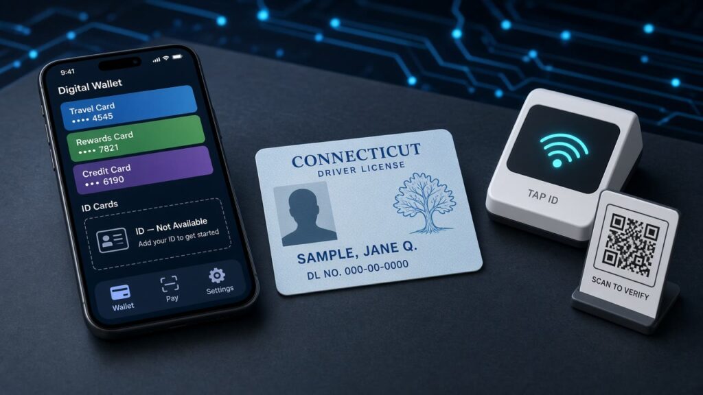
A phone with a digital wallet showing an empty ID slot next to a sample Connecticut driver's license, an NFC tap reader, and a QR code stand

Connecticut Promised Me Apple Wallet in 2021. I Got Another App.

Originally published on snarky.tech.

A phone with a digital wallet showing an empty ID slot next to a sample Connecticut driver's license, an NFC tap reader, and a QR code stand
The wallet has a spot for my ID. Connecticut has an app instead. (Illustration, sample ID.)

Good news, Connecticut: after years of waiting, we’re finally getting a digital driver’s license. The DMV says Connecticut Mobile ID launches November 18. (ct dmv)

Bad news: it’s not in Apple Wallet. It’s not in Google Wallet or Samsung Wallet either. It’s another app. A separate, free “Connecticut Mobile ID” app you download from the App Store or Google Play, built by a vendor called IDEMIA. (idemia)

That’s not what we were promised.

Remember 2021?

On September 1, 2021, Apple announced the first states signed up to put driver’s licenses in Apple Wallet: Arizona, Connecticut, Georgia, Iowa, Kentucky, Maryland, Oklahoma, and Utah. Governor Lamont was right there in the press release: “We’re pleased to be one of the first states working with Apple to deploy driver’s licenses and state identification cards in Apple Wallet.” (apple)

One of the first. Let’s check the scoreboard. Arizona, Georgia, Iowa, Maryland, and Oklahoma from that original list all have IDs in Apple Wallet today. Apple’s list is now up to 16 states plus Puerto Rico. Connecticut isn’t on it. (apple, macrumors)

When I originally complained about the slow rollout last year, my question was simple: why is this taking so long? More than a year later, the answer appears to be “we were building something else.”

Wallet support is “coming soon.” Sure.

The IDEMIA help page literally asks the question: can I put my Connecticut license in Apple, Samsung, or Google Wallet? The answer: “These features will be coming soon.” (idemia)

How soon? In May, the State Bond Commission approved money for a “State of Connecticut digital wallet,” with a goal of rolling it out “by the end of the summer.” The same plan pushes compatibility with Apple, Google, Samsung, and other commercial wallets out to August 2027. (ct governor) Summer came and went. The app now lands just before Thanksgiving. And the thing the governor bragged about in 2021 is officially the sequel.

Why the app is the wrong call

The whole point of Apple Wallet is that it’s already on my phone. My credit cards, boarding passes, and transit cards are there. With an ID in Wallet, you tap your iPhone or Apple Watch on the reader, approve with Face ID, and you never unlock or hand over your phone. (apple)

Here’s what Connecticut is offering instead: download an app, wait for a verification text, photograph the front and back of your license, do a selfie dance, and then show your ID by generating a QR code for a “verify reader” to scan. (idemia) Businesses aren’t required to accept it, they need a “compatible verification app” if they do, and the DMV itself says acceptance “will initially be limited.” Police won’t take it, and you can’t use it to vote. Keep carrying the plastic card. (ct dmv)

And now the confusion part. If you have a passport, Apple Wallet already lets you make a passport-based Digital ID that TSA accepts. (tsa) So a Connecticut resident heading to Bradley could have a Digital ID in Wallet, a separate state app, and the physical license they still have to carry. Three IDs, one person, and a TSA officer wondering which one you’re about to wave at them. Then, maybe in 2027, a fourth version in Wallet.

It’s not like the neighbors are setting the pace either. TSA lists New York’s mobile ID as the “NY MiD app” only, and no New England state is on Apple’s list. (tsa, apple) Connecticut had a real shot to be the first in the region to do this the easy way. Apple put its name next to ours five years ago.

Here’s how this ends. Calling it now.

The DMV commissioner says he’s looking forward to “the increased adoption and use of Mobile ID amongst residents.” (ct dmv) Here’s my prediction for how that goes.

  • Step 1: Launch a standalone app nobody has heard of, that most businesses don’t scan, that police won’t accept.
  • Step 2: Few people download it, because why would they? Their phone already has a wallet, and they still need the card.
  • Step 3: Businesses see few customers using it, so they don’t bother setting up a verifier. Which means even fewer people use it.
  • Step 4: Somewhere around the August 2027 deadline, someone in Hartford points at the download numbers and says there “isn’t enough interest” to justify the Apple Wallet work.

Low adoption won’t mean people don’t want a digital ID. It’ll mean the state shipped the version people didn’t want, then used the results as proof. I hope I’m wrong. I’ve been wrong before. Not often about the DMV.

What Connecticut should do

  • Make Apple, Google, and Samsung Wallet the priority, not the sequel. Sixteen states figured it out. Several of them were in the same 2021 press release as us.
  • Don’t judge demand by the app. If you want to know whether people want a digital ID, measure it after it’s in the wallet they already use.
  • Give us an actual date. “Coming soon” has been the plan since 2021.

So I’ll ask again, five years in: why is this taking so long? And when it finally shows up in Wallet, will anyone in Hartford still be paying attention?

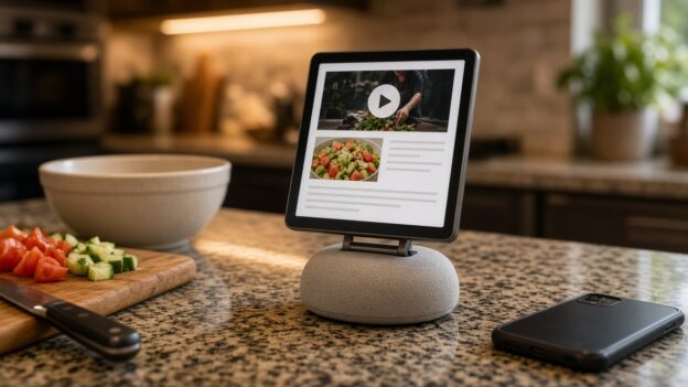
A small square-screened smart home display on a kitchen counter showing a cramped web page with a video and a recipe, next to chopped vegetables and a smartphone

Apple Built a $299 Kitchen Screen. It Can’t Run YouTube or My Recipe App.

Originally published on snarky.tech.

Apple finally made the thing a lot of us have wanted for years: a screen for the kitchen counter. It’s called HomeView (one word, and no, it’s not “HomePad” or “homeOS” like the rumors said). It has a 7-inch square display, a speaker base, Siri AI, and a $299 price tag, and it starts shipping November 13. (apple) Apple’s own press release literally calls it “the perfect addition to a kitchen counter.”

Great. So what’s the number one thing people do with a screen in the kitchen? They watch YouTube while they cook. And HomeView doesn’t have a YouTube app.

No App Store, so no YouTube

HomeView has no App Store. What you get is a list of built-in Apple apps: Alarms, Calendar, FaceTime, Find My, Home, Intercom, Messages, Music, Podcasts, Reminders, Safari, Settings, Timers, Weather, and World Clock. (apple) Third-party apps only show up if they run on your iPhone and support CarPlay. Not a HomeView app. A CarPlay app. (macrumors)

Apple’s CarPlay developer guide spells it out: CarPlay audio and video apps “also work on Apple HomeView” with no changes. (apple) That’s how Spotify gets in. The app actually runs on the phone, and HomeView basically acts as its screen. (engadget)

And here’s the catch, one I’ve already complained about: CarPlay video apps only arrived this year with iOS 27, and no automaker has announced support for them. The Apple TV app is the first confirmed one. (macrumors) So YouTube, Netflix, and Disney+ have had zero reason to build one. 9to5Mac frames HomeView as the push that might change that, “if they say yes.” (9to5mac) As of launch, Apple hasn’t named YouTube anywhere, and Engadget says flatly there’s no YouTube on CarPlay, and there won’t be on HomeView either. (engadget)

“Just use Safari” is garbage

The fallback everyone’s pointing to is Safari. HomeView does ship with a real version of Safari, and heise reports you can use it to watch YouTube or Netflix in the browser until proper apps show up. (heise) Engadget is more careful, saying Safari “likely” means you can watch web video, “but the experience isn’t the same as using an app.” (engadget)

I haven’t had my hands on one, and I haven’t pre-ordered one either, since it doesn’t ship for two more weeks. But I’ve used YouTube in a mobile browser, and I know how this goes. You get nagged to open the app. You sign in again. Your subscriptions and Watch Later are buried somewhere. And now picture doing all that on a 7-inch square screen with flour on your fingers, while a widescreen video plays letterboxed on a square display. (9to5mac)

Apple made a $299 kitchen screen, and the plan for the most popular video site on earth is “it theoretically works in a web page.” That’s not a feature. That’s a shrug.

And let me run Paprika

Here’s the part that really gets me. Apple clearly knows HomeView is a kitchen device, because it built a whole cooking feature. When you open a recipe in Safari, a “Start Cooking” button turns it into step-by-step instructions with ingredient tracking and hands-free timers. You can even hand a recipe off from your iPhone. (macrumors) The Verge’s hands-on called it a favorite feature, and that’s fair. (the verge)

But that only works for recipes on the web. AppleInsider noticed it right away: recipe apps like Crouton, NYT Cooking, or Paprika “seem to be natural fits,” but “the only recipes you can load are via Safari.” (appleinsider)

My recipes don’t live in Safari. They live in Paprika 3, where I’ve saved, edited, scaled, and organized them for years. And Paprika can’t get onto HomeView, because recipe managers aren’t on CarPlay’s app list. CarPlay’s categories are things like audio, navigation, EV charging, parking, and quick food ordering. (apple) One developer who dug into the docs points out that a recipe app simply can’t get a CarPlay entitlement, so it can’t get onto HomeView. (pantuso)

So Apple’s kitchen screen can’t run a kitchen app, because the rules were written for your car. Read that again.

What Apple should do

  • Open HomeView to real apps. It has an A18 chip (cnbc) and runs what Engadget describes as an iOS-based operating system. (engadget) It can run an app.
  • Add a kitchen category. If Apple insists on the CarPlay-style approach, at least create a recipe category so Paprika, Crouton, and NYT Cooking can show up.
  • Get YouTube on day one, or close to it. Spotify is already named as working. Apple should pick up the phone and call Google.

HomeView looks great, and honestly, the Safari cooking mode is a smart idea. But Apple built a kitchen screen and then decided the two things people most want in a kitchen, their videos and their own recipes, could just go through a web browser. For $299, I expect better than that.

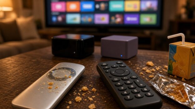
A smudged, crumb-covered silver touchpad remote next to a simple black button remote on a living room coffee table, with two generic streaming boxes and a TV full of app tiles behind them.

Everyone Loves the Apple TV. Then a Kid Picks Up the Remote.

Originally published on snarky.tech.

If you want to stream to a TV in 2026 without using whatever came baked into the TV, you’ve really got three serious choices: Roku, Apple TV, and the really great Nvidia Shield. Read almost any tech site and the verdict is the same. Apple TV is the fancy one, the fast one, the one reviewers put at the top of the list.

And I get it. The box is fast and the interface is clean. But in a house with kids, the Apple TV has one giant problem, and you hold it in your hand.

The Siri Remote is a touchpad in a house full of sticky fingers

The new Apple TV 4K comes with a new Siri Remote, and Apple says it “keeps its familiar design.” (apple) That means the same touch-enabled clickpad, where you tap to select, swipe through lists, and run your thumb around the outer ring to scrub through a video. (apple) The headline new feature is Find My, so you can locate the remote when it slides into the couch. (macrumors)

Here’s my problem. Those touch features are way too touchy. A kid picks up the remote and the show jumps ahead. A thumb rests on the pad and the menu goes flying. Add fingers that were just in a bag of crackers and it gets worse, and I end up being tech support for my own living room.

Apple’s answer is a setting. Go into Settings, then Remotes and Devices, and you can switch the clickpad to “Click Only” or slow down the touch tracking. (apple) But if the fix for your remote is turning off the remote’s main feature, maybe the main feature was the problem.

The Roku remote is the opposite. Up, down, left, right, OK, back, home. Buttons that do one thing every time, no matter whose hands are on it. Boring is exactly what you want in a remote.

So I replaced Apple’s remote

I got fed up and bought a One For All URC1110 on Amazon. It’s a replacement remote made for Apple TV. It has real buttons, Siri voice control, keys that light up when you pick it up, and it can also run your TV and sound system. One For All says it works with Apple TV HD and 4K. (one for all) It’s around $38 on Amazon as I write this, which is less than the $59 Apple now charges for a new Siri Remote. (macrumors)

It works much better. Think about that for a second. The best way I’ve found to enjoy a $299 Apple product is to throw out the part Apple designed and use a $38 remote from somebody else.

CEC: Roku just behaves a little better

HDMI-CEC is what lets your streaming box turn on the TV, switch inputs, and control your soundbar volume. When it works, it’s magic. When it doesn’t, you’re digging for the TV remote anyway.

In my experience, CEC works slightly better on Roku than on Apple TV. Not night and day, but noticeable. Roku even has a plain support page walking you through the CEC settings. (roku) The Apple TV mostly works too, but I’m clearly not the only person who has watched it turn on the TV and then pick the wrong input. (apple community)

The price no longer makes sense

Here’s where it gets silly. The new Apple TV 4K comes in one version with 128GB of storage, and it’s $299. (apple) MacRumors points out the starting price was $129 earlier this year. (macrumors) It ships November 13.

The Roku Ultra is $149.99. Roku raised it from $99.99 in July, blaming the memory shortage. (the verge) For that you get 4K with Dolby Vision and HDR10+, Dolby Atmos, Wi-Fi 6, Ethernet, a USB port, and the Voice Remote Pro, which is rechargeable, has backlit buttons, and has a lost-remote finder. (roku)

So the Apple TV is now about twice the price of the Roku Ultra, and it comes with the worse remote. Yes, the Apple TV has a faster chip and some Apple-only tricks. For what most families actually do, I can’t make that math work.

And the Shield? Still really great, and still getting software updates. (nvidia) But Nvidia stopped making the regular Shield TV and raised the Shield TV Pro to $299 in October, on hardware that dates back to 2019. (techpowerup) So the Shield is now in Apple TV price territory too.

Yes, Roku has ads

Roku isn’t perfect. It makes its money on ads, and it shows. Its big home screen redesign in May put a large ad on the screen the moment you turn it on, and it stays there while you browse. (ars technica)

But that’s basically where it lives: the home screen. Once I open an app and start watching, Roku gets out of the way. The main exception I know of is Roku’s own free Roku Channel, where Roku says it does run ads when you pause. (android authority) I can live with a billboard in the lobby. I can’t live with a remote that fast-forwards every time my kid breathes on it.

My pick

If you’re a single adult with clean hands and a big Apple setup, sure, get the Apple TV. For a family, I’d get the Roku Ultra and save $150. If you’re already on Apple TV, do yourself a favor and buy a remote with buttons. Apple makes beautiful hardware, but a remote doesn’t need to be beautiful. It just needs to work.

A car dashboard screen in a parking garage at dusk sends a voice message, while incoming chat bubbles with muted-speaker icons float above it, unheard.

I Can Tell Siri to Send a Facebook Messenger Message in CarPlay. It Just Won’t Read Me the Reply.

Originally published on snarky.tech.

My friends and I aren’t kids anymore. We don’t need Reels, we don’t need Marketplace, and we definitely don’t need the Facebook feed telling us what a guy from high school thinks about seed oils. What we do use, every single day, is Facebook Messenger. It’s where the group chats live. It’s how we actually talk.

And it works great, right up until I get in the car.

Why I’m still on Messenger

People keep telling me to just move everyone to WhatsApp. Here’s why I haven’t: Messenger is synced across everything I own. Phone, tablet, Mac, PC. I can have it open on all of them at once and, as far as I can tell, it doesn’t care how many. I pick up whatever device is closest and the conversation is just there.

WhatsApp does care. Its own help center says you can link “up to four devices at a time” to your primary phone, and that you still need that phone to register the account and link anything new. Leave WhatsApp unused on the phone for more than 14 days and your linked devices get logged out. (whatsapp) That’s fine for a lot of people. It’s a hassle for anyone who lives across a bunch of screens.

Sending works. Hearing doesn’t.

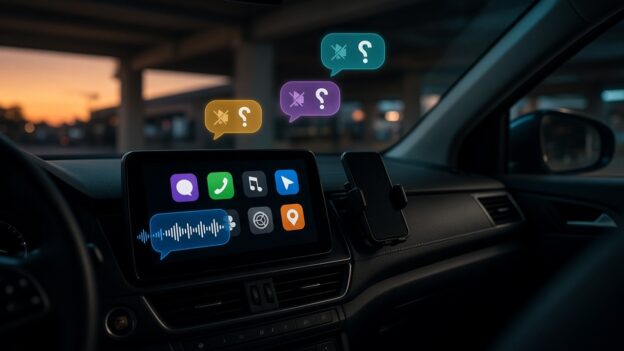
Here’s the part I can’t wrap my head around. In the car, I can say “Hey Siri, send a message to so-and-so on Messenger,” and it works. Meta added Siri support for sending Messenger messages and making calls back in November 2024. (macrumors) Messenger calls have shown up on CarPlay screens even longer, since 2016. (heise)

But when a friend writes back? Nothing. There’s no Messenger app on my CarPlay screen, no “read it to me,” no reply button. My message goes out into the world, and the answer lands in my pocket where I’m not supposed to be looking. That’s a one-way street with a very loud on-ramp and no exit.

Compare that with the other two messaging apps on my phone:

  • Apple Messages in CarPlay lets you hear unread messages and reply to a conversation, all by voice. (apple)
  • WhatsApp, which is also owned by Meta, launched a standalone CarPlay app in April 2026 with chat and call history and voice-dictated replies. (mashable) In July, WhatsApp refreshed it again: “hear and respond to messages, make calls, see your call history, and reach your favorites, all hands-free.” (macrumors)

So Meta knows exactly how to do this. It did it for WhatsApp. This year. Twice.

The “hack” I don’t want

The workaround people point to is an iPhone setting called Announce Notifications. Turn it on for CarPlay, and Siri will read incoming notifications out loud. (apple) Some drivers say it does read their Messenger messages this way.

I don’t want that. It’s a blunt instrument. It’s an iPhone feature reading whatever pops up on my lock screen, not Messenger actually working in my car. I’d be tuning a phone-wide setting to make up for one app that never showed up to the job. And it’s still not a real conversation: no list of chats, no picking who to hear from, none of the stuff Messages and WhatsApp just do.

This isn’t Apple’s fault (mostly)

I usually love blaming Apple. Not this time. Apple publishes exactly what a messaging app needs to work in CarPlay. Support three Siri actions: send a message, find unread messages, and mark them as read. Then get a CarPlay messaging entitlement from Apple. (apple) Apple’s own WWDC session spells out that Siri reads new incoming messages through one of those actions. (apple)

Messenger already does the first one, because that’s how sending by Siri works. The other two are the part that lets Siri read messages to you. That’s the missing piece. On Apple’s community forums, the standard answer to “why isn’t Messenger on CarPlay?” is the same every time: it’s up to Facebook to build it. (apple community)

So why won’t Meta do it?

I looked. I couldn’t find Meta ever explaining why Messenger reads nothing in CarPlay while WhatsApp reads everything. So here’s my guess, and it’s only a guess: Messenger isn’t where Meta’s attention is.

The evidence is hard to miss. Meta killed the Messenger desktop apps for Mac and Windows in December 2025 and sent people to the Facebook website instead. (techcrunch) Then it shut down messenger.com in April 2026. On a computer, Messenger now lives at facebook.com/messages. (techcrunch)

Read that again. The one Meta product people like me actually want is being folded back into the one we don’t. And the polished car experience went to WhatsApp instead.

Meta, it’s three Siri actions

I’m not asking for video calls on the dashboard or Reels at red lights. I want what Messages and WhatsApp already do:

  • Read me a new message when it comes in.
  • Let me reply by voice.
  • Put a simple Messenger icon on CarPlay with my recent chats.
  • Do it with the Siri actions Apple already publishes, not a phone-wide notification workaround.

There are a lot of us who picked Messenger precisely because it’s simple, it’s everywhere, and it doesn’t make us think about how many devices we’re allowed. We’re also the people who most want to keep our eyes on the road. Meta already lets us talk to Siri. It’s time to let Siri talk back.

Illustration: a plug-in hybrid at a public EV charger at dusk, with a phone showing a Charging Complete alert and a $50.00 pending charge

ChargePoint Has a Great Notification System. It Just Won’t Tell You About Your Money.

Originally published on snarky.tech.

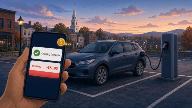
I plugged my plug-in hybrid into a ChargePoint station in the Alexion garage at 100 College Street in New Haven. Not a Tesla, not a 100 kWh battery on wheels. A plug-in hybrid, the car equivalent of a phone you top off on the way out the door. And when I looked at my account and my card afterward, I found two things the ChargePoint app never bothered to mention: a 25-cent fee, and a $50 pending charge sitting on my credit card.

To be clear up front: the $50 isn’t money ChargePoint kept. It’s a pre-authorization hold, the thing gas pumps and hotels do to make sure your card works. It drops off. But it’s $50, it used to be $25 for me, and nothing in the app told me it was coming or why it doubled. That’s the real story here. Not the money. The silence.

The 25 cents

What looks like the explanation for the quarter is ChargePoint’s own “Service Fee.” Starting in March 2026, ChargePoint began adding a per-session fee on paid sessions, on top of whatever the station owner charges. Per ChargePoint’s FAQ, it’s $0.25 for AC charging and $0.49 for DC if you have a ChargePoint account, and $0.49 / $0.99 if you’re a guest paying with a card. (chargepoint) Free sessions and zero-energy sessions are exempt.

A quarter is a quarter. I’m not starting a GoFundMe. But think about who it hits hardest. On a big EV, 25 cents disappears into a $20 session. On a plug-in hybrid, where a full charge might not cost much more than a fancy coffee, a flat per-session fee is a much bigger slice of the bill. Plug in for a short top-off and the fee can be a real percentage of what you paid for actual electricity.

Did ChargePoint announce it? Apparently, yes. There was an email to drivers, and my hometown of Guilford, just down the road, even posted a notice that ChargePoint, not the town, would be collecting the new fee at the town’s chargers. (guilford) Maybe that email is sitting in my promotions folder next to 400 offers for gutter guards. But an email in February is not the same as telling me at the moment I’m paying.

The $50 that used to be $25

Here’s the part that actually got my attention. A pending $50 charge from ChargePoint. ChargePoint’s FAQ explains that a pre-authorization is “a temporary hold placed on your payment method before a charging session begins” to confirm the card works, and that it’s “not a permanent charge.” (chargepoint) Fine. Normal. Gas stations do it.

But $50? For a plug-in hybrid? At typical public Level 2 prices, it’s hard to picture a plug-in hybrid session costing anywhere near $50. And the holds I’d seen from ChargePoint before were $25. Nothing in the app said “heads up, the hold on this session is now $50.” I found out by looking at my card.

So I went looking for the actual policy. ChargePoint publishes it, sort of, spread across a couple of FAQ pages:

  • Sessions started with a ChargePoint account: $25 hold for AC, $50 for DC. (chargepoint)
  • Sessions started without a ChargePoint account: a $50 hold. (chargepoint)
  • Releasing the hold can take up to seven business days, depending on your bank. (chargepoint)

Those account amounts don’t seem to be new, either. An archived copy of the FAQ from January 2026 shows the same $25 AC / $50 DC numbers. (wayback machine) So, as far as I can tell, ChargePoint didn’t quietly raise the published hold. Which makes the jump more confusing, not less.

So why did mine double?

I don’t know, and ChargePoint didn’t tell me. These are my best guesses from reading ChargePoint’s own rules, and they’re guesses:

  • The session didn’t count as an “account” session. ChargePoint’s guest rules apply when you pay “through other means,” like a card at the station. If the session got started or authorized some way the system treated as not-my-account, the published hold is $50 instead of $25.
  • The charger was treated as DC. The account hold is $50 for DC sessions. This is a Level 2 (AC) charger, so it shouldn’t apply, but if the system somehow classified the session as DC, $50 is the published number.
  • Something changed on the payment side. ChargePoint says its “payment processors may place” the hold. That wording leaves room for the hold to vary by processor, payment method, or wallet. Other drivers online have described seeing a different hold than the one the station showed, so I don’t think I’m the only one confused. That part is anecdotal.

Any of those could be totally legitimate. That’s not my complaint. My complaint is that I had to become a part-time ChargePoint FAQ archaeologist to figure out which one it might be.

Then came the $7 parking fee

And then, just to make sure I was paying attention, ChargePoint topped it off. On a more recent session at the same garage I never got the notification that my car was almost full. What I got instead was an email, not a push, warning me that I’d be charged if I didn’t move my car. That email showed up about an hour after the charging had already finished. By then the meter was running. I ended up paying over $7 in parking fees for about $3 worth of electricity.

Read that again. The parking penalty cost more than twice as much as the thing I came for. And the only warning arrived by the slowest channel available, an hour too late to matter.

You might say, just set a timer. I’d love to. But this is a shared Level 2 charger, so the power gets split when two cars are plugged in. If I’m alone, it charges one speed. If someone pulls in next to me, it slows down. There’s no way to predict when the car will be done, which is exactly why I need the notification to work.

And no, my car can’t cover for ChargePoint. My Jeep sends charging alerts through SiriusXM, which means a separate monthly subscription, and even then the signal doesn’t do well on the second floor of a nine-story parking garage. So the ChargePoint app is the one thing that should be telling me my car is full. It didn’t.

Could I fight the $7? Sure. In my experience, getting a human on the phone at ChargePoint takes 20 minutes or more. I’m not spending half an hour of my life to win back seven dollars, and I suspect a lot of people make the same math. That’s what makes this so annoying. ChargePoint is very good at billing me for every minute and every quarter. It just can’t seem to get one push notification to my phone on time.

The notification system is right there

This is what really bugs me. ChargePoint already has a notification system, and it’s not shy. The app can push you alerts for charge complete, charge interrupted, and receipts, and it lets you customize push and email. (chargepoint) It knows when my car stops pulling power. It knows the price. It knows how much it’s about to hold on my card. It knows whether the session counts as account or guest, AC or DC.

And yet the two things that actually involve my money, a new per-session fee and a hold that doubled, show up as fine print, a line on a receipt, or a pending charge on my bank app. ChargePoint’s advice is to check each station’s pricing in the app before you start. (chargepoint) The hold amounts, as far as I could find, live in the FAQ, not in a notification. Shown somewhere is not the same as told to me.

There’s even a bit of irony here for plug-in hybrid owners. ChargePoint’s “charging complete” alert, as other drivers have described it, is based on the car no longer drawing power, not on the car actually being full. (rav4world) So the notification system will happily ping me about my car’s battery, sometimes wrongly, but not about my credit card.

What ChargePoint should do

None of this needs new technology. It needs a few notifications they apparently haven’t thought were worth sending:

  • Tell me the hold before I plug in. “This session will place a $50 temporary hold on your card. It will be released within 7 business days.” One line on the start screen.
  • Tell me why it’s different. If the hold is $50 instead of my usual $25, say why: DC station, guest payment, whatever it is.
  • Itemize the service fee in the push, not just the receipt. “Energy: $X. Station fee: $Y. ChargePoint service fee: $0.25.”
  • Warn me before the parking fee starts, by push, on time. If I’m going to be billed for idling, the “your car is full, move it” alert needs to hit my phone when charging ends, not land in my email an hour later.
  • Send a “hold released” alert. The app tells me the second my car stops charging. It can tell me when my $50 is back.

I’m not saying ChargePoint is scamming anyone. The hold is a hold. The fee is published. On paper, it all checks out. But a notification system that can’t even tell me my car is done on time, and stays silent about what’s happening to my card, is a notification system pointed at the wrong thing.

Twenty-five cents, a temporary $50 and a $7 parking fee aren’t going to ruin my week. Finding out from my bank app instead of from ChargePoint’s app, though, is exactly the kind of small surprise that makes people trust public charging a little less. And public charging needs all the trust it can get.